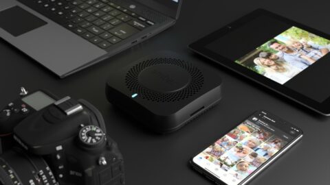
LatticeWork is the creator of the Amber line of security and privacy focused personal cloud devices. This site is the third major iteration of the Amber website designed by Freehive, and the first built solely by the Freehive team. The objective of this iteration was to better represent the two products available and create a more intuitive overall site experience. The site makes use of animations and other visuals created for prior versions of the site, with some new content. The site was rebuilt from the ground up with WordPress, utilizing the Oxygen visual builder to expedite future refinements.
Lifestyle product imagery is an important part of telling a product's story. Beyond the practical benefit of showing a product with diverse perspectives and at scale, it fosters important emotional connections. The people and environments a product is shown with help potential customers envision themselves using it. It shows them what that experience would feel like. It highlights the benefits of a products use over just its physical appearance.
Unfortunately great lifestyle photography with diverse models and environments is expensive. Most brands end up with a limited variety of imagery, which limits the potential connection customers could have. Fortunately Freehive has a powerful solution. By pairing accessible stock photography with proficiency in 3D rendering and 2D image manipulation, Freehive is able to create diverse composite lifestyle imagery rapidly and affordably.


A before/after image demonstrating how a stock photo can become a personalized lifestyle image.
There are various ways to incorporate animation on a site. One of our favorites is to employ looping animated videos. When done tastefully these can add a premium feeling to the site without the browser specific limitations of other methods. When done tastefully, these can add energy to the site without detracting from the written word.
The goal with a looping video is to keep the repetition subtle and seamless. Often the length will be less than 10 seconds, but in some cases we may display lengthier videos, especially if we think the placement will allow us to capture attention longer. The examples show represent both approaches.
Keeping a website up-to-date in an affordable manner is an important requirement of many clients. That means enabling staff with little technical or design knowledge to make edits to that content which changes regularly, such as product promotions, pricing, blog articles, etc. It also means making changes to layout and creative content easier for Freehive staff in the long-term. To do so we utilize WordPress and a couple additional noteworthy plugins.
This project was completed using powerful Free and Open Source Software anyone can learn and use without a subscription or paid commercial license. Here is a brief showcase of how we created the composite lifestyle images for the site.
We're happy with how this site turned about, but even more happy with the results. In one case, with the first batch of analytical data after site launch, we were able to rapidly implement changes that led to a substantial increase in checkout conversions. This was possible due to the site being built with WordPress and Oxygen.
We've also since heard reports of a surprising increase in customers landing on the site from paid campaigns to learn about their entry-level product, who are then purchasing their premium product. These are early evidence that the site isn't just beautiful, but it's working.